****** TOP TIP ******
Don’t try and tweak a Blog entry while on the train. I foolishly erased the contents of this entry and have had to refill them by memory. Ho Hum….
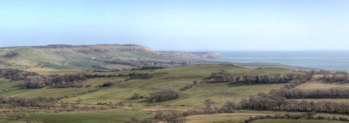
Fotospeed emailed me back the ICC printer profiles and I installed them as per their instructions. I have prepared a suitable panoramic view of Kimmeridge Bay from Whiteway Hill (constructed from 4 HDR images) from a recent trip to Dorset as my test image. It has been cropped to the ratio of the Fotospeed panoramic paper of 210 x 594 in preparation to print. This image can be seen below:
I am working Saturday and plan to do the test print on Sunday. I am nervous as I want this print to be as good as it can be, and I hope that by following the colour management process workflow will have proved to have be worthwhile.
I will update this entry after I have completed the test print on Sunday.
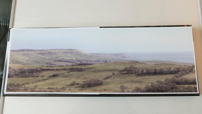
Sunday Update:
Some care and attention to detail required when perparing to print, but the effort was worthwhile. The print was made using the Platinum Baryta 300 paper and the result is very pleasing.
I will need to try different pano images styles (i.e. B&W, high contrast, vivid colour etc.) on the various papers in the test pack.
